tidyverseに含まれるggplotで棒グラフを作るときの様々な作り方です。シンプルな作り方から積み上げ、構成比をみる帯グラフの使い方と数値ラベルの付け方もあわせてご紹介していきます。
棒グラフの可視化(count)
まずは手始めに前準備と可視化です。ggplotのbarplotはデフォルト設定だと表データの件数をプロットしてくれます。
# 前準備
library(tidyverse)
library(scales)
d <- read.csv("https://raw.githubusercontent.com/maruko-rosso/datasciencehenomiti/master/data/ShopSales.csv")
theme_set(theme_bw())
# グラフの可視化
d %>% ggplot(aes(y = shop)) +geom_bar()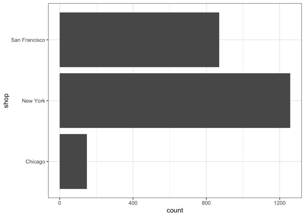
棒グラフの可視化(合計)
以下のようにすることでファクター毎の合計値をプロットします。おそらくよく使っていくのはこちらになるのではないかと思います。
d %>%
   ggplot(aes(x = shop,y = price)) +
   geom_bar(stat = "identity")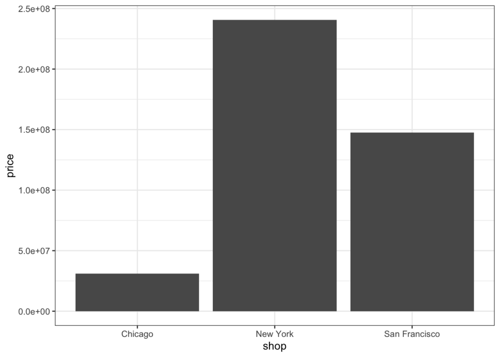
棒グラフにラベル
geom_textとlabelを組み合わて数値ラベルをつけることができます。また、vjustで位置の調整ができます。
d %>%
    group_by(shop) %>%
    summarise(price = sum(price)) %>%
   ggplot(aes(x = shop,y = price, label = scales::comma(price))) +
   geom_bar(stat = "identity") +
   geom_text(vjust = -0.5)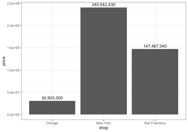
棒グラフの並び替え
reorderを使って軸の並び替えができます。
d %>%
    group_by(shop) %>%
    summarise(price = sum(price)) %>%
   ggplot(aes(x = shop,y = price, label = scales::comma(price))) +
   geom_bar(stat = "identity") +
   geom_text(vjust = -0.5)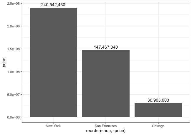
棒グラフの積み上げ
積み上げ棒グラフ以下のようにフィルターをいれることでできます。
d %>%
   ggplot(aes(x = shop,y = price, fill = staff)) +
   geom_bar(stat = "identity") +
   scale_fill_brewer(palette='Set1')
積み上げ棒グラフに数値ラベル
d %>%
   group_by(shop,staff) %>%
   summarise(price = sum(price)) %>%
   ggplot(aes(x = shop,y = price, fill = staff,label = scales::comma(price))) +
   geom_bar(stat = "identity") +
   scale_fill_brewer(palette='Set1') +
   geom_text(position = position_stack(vjust = .5))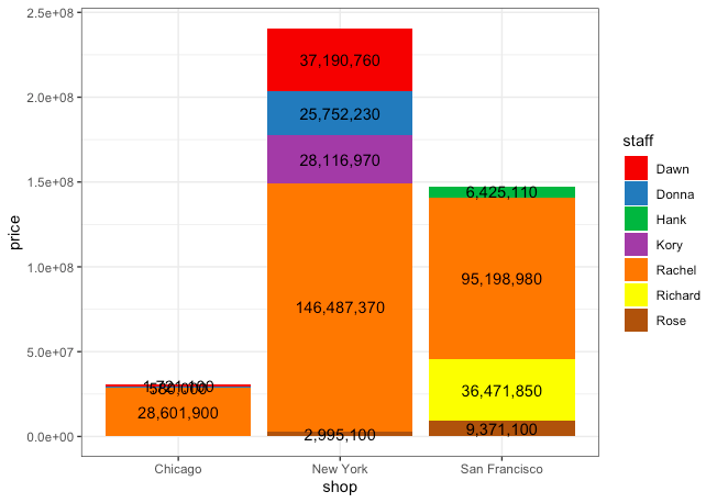
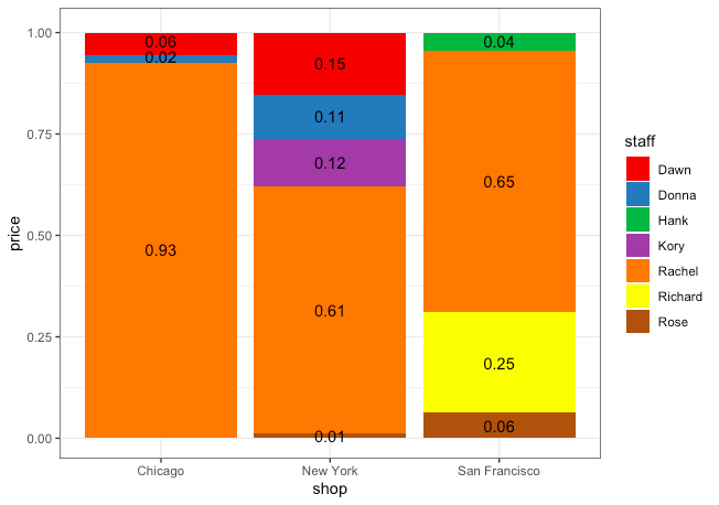
帯グラフ(棒グラフの構成比)
先ほどの積み上げ棒グラフを構成比をみる帯グラフに変える方法です。
d %>%
   ggplot(aes(x = shop,y = price, fill = staff)) +
   geom_bar(stat = "identity", position = "fill") +
   scale_fill_brewer(palette='Set1')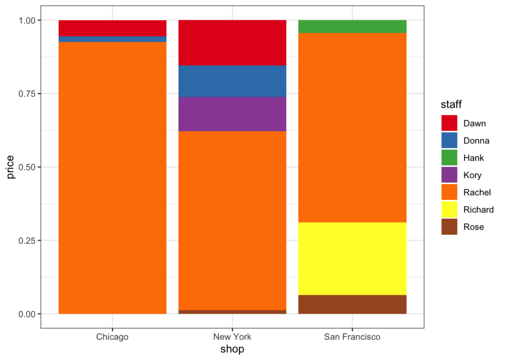
帯グラフへの数値ラベル
d %>%
   group_by(shop,staff) %>%
   summarise(price = sum(price)) %>%
   mutate(p_label = round( price / sum(price),digits = 2)) %>%
   ggplot(aes(x = shop,y = price, fill = staff,label = factor(p_label))) +
   geom_bar(stat = "identity", position = "fill") +
   scale_fill_brewer(palette='Set1') +
   geom_text(aes(y=p_label),position = position_stack(vjust = .5))