Rのtidyverseパッケージに含まれているggplot2ライブラリを活用した箱ひげ図作り方のご紹介です。他にもdplyrやscalesパッケージも利用しています。散布図のラベルの付け方や回帰線の付け方もご紹介です。
散布図の作り方
d %>%
   group_by(staff) %>%
   summarise(price_ave = mean(price), quantity = sum(quantity)) %>%
   ggplot(aes(x = quantity, y = price_ave)) +
   geom_point()
散布図の作り方② ラベルでプロット
散布図のポイントをテキストに置き換えて表示できます。labelに設定し、geom_pointo をgeom_textに置き換えることで表示できます。もちろん併用して重ね掛けもできます。
d %>%
   group_by(staff) %>%
   summarise(price_ave = mean(price), quantity = sum(quantity)) %>%
   ggplot(aes(x = quantity, y = price_ave,label = staff)) +
   geom_text()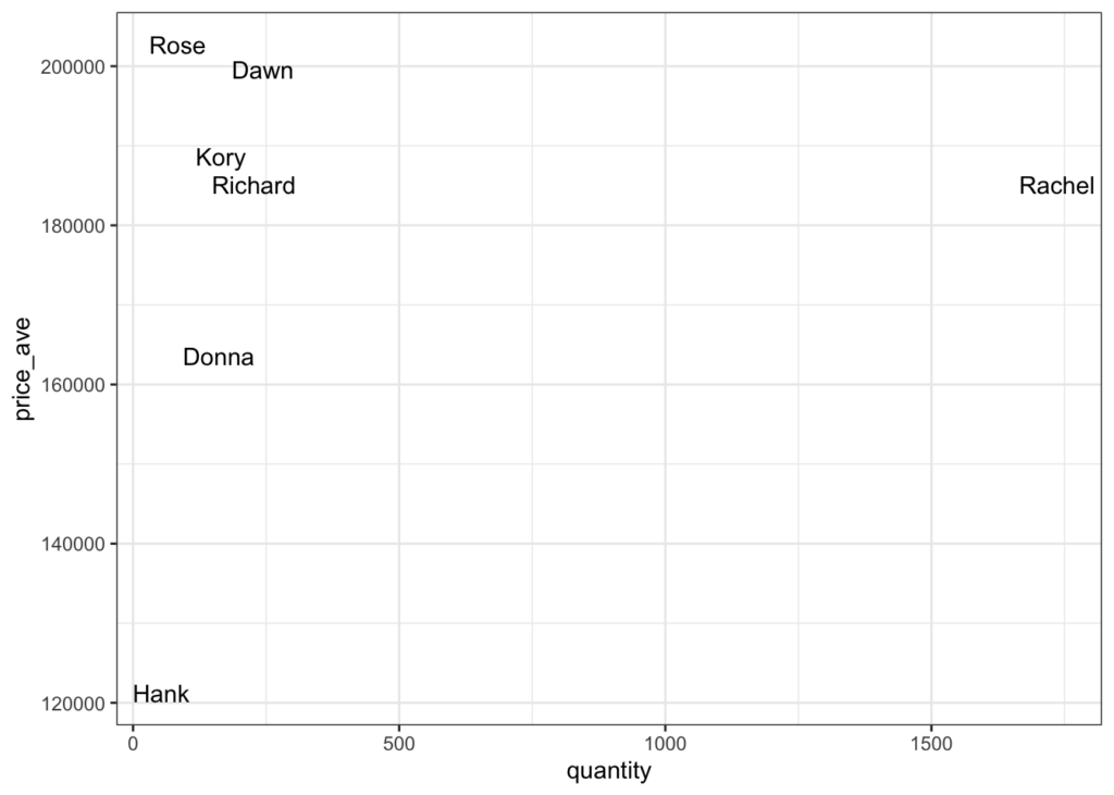
散布図の作り方③
散布図の分布をみるために中央値や平均値で線を加えるてみることで傾向をみることができます。
d %>%
   group_by(staff) %>%
   summarise(price_ave = mean(price), quantity = mean(quantity)) %>%
   ggplot(aes(x = quantity, y = price_ave,label = staff)) +
   geom_text() +
   geom_line(aes(y = median(price_ave))) +
geom_line(aes(x = median(quantity))) 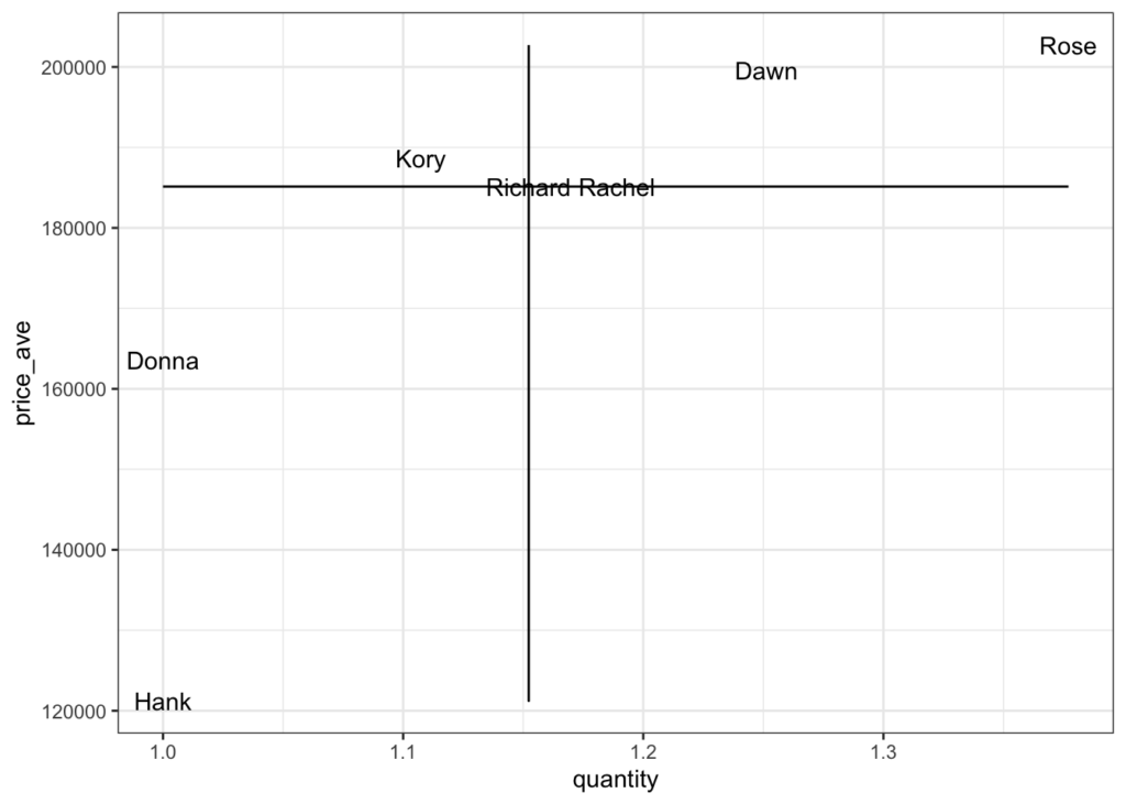
散布図に回帰直線を引く
散布図に回帰直線をひくことができます。また、回帰線意外にもglmやgam、lossの設定もできます。
iris %>%
   ggplot(aes(x = Sepal.Length, y = Sepal.Width,label = Species )) +
   geom_point() +
   geom_smooth(method ="lm", se = F)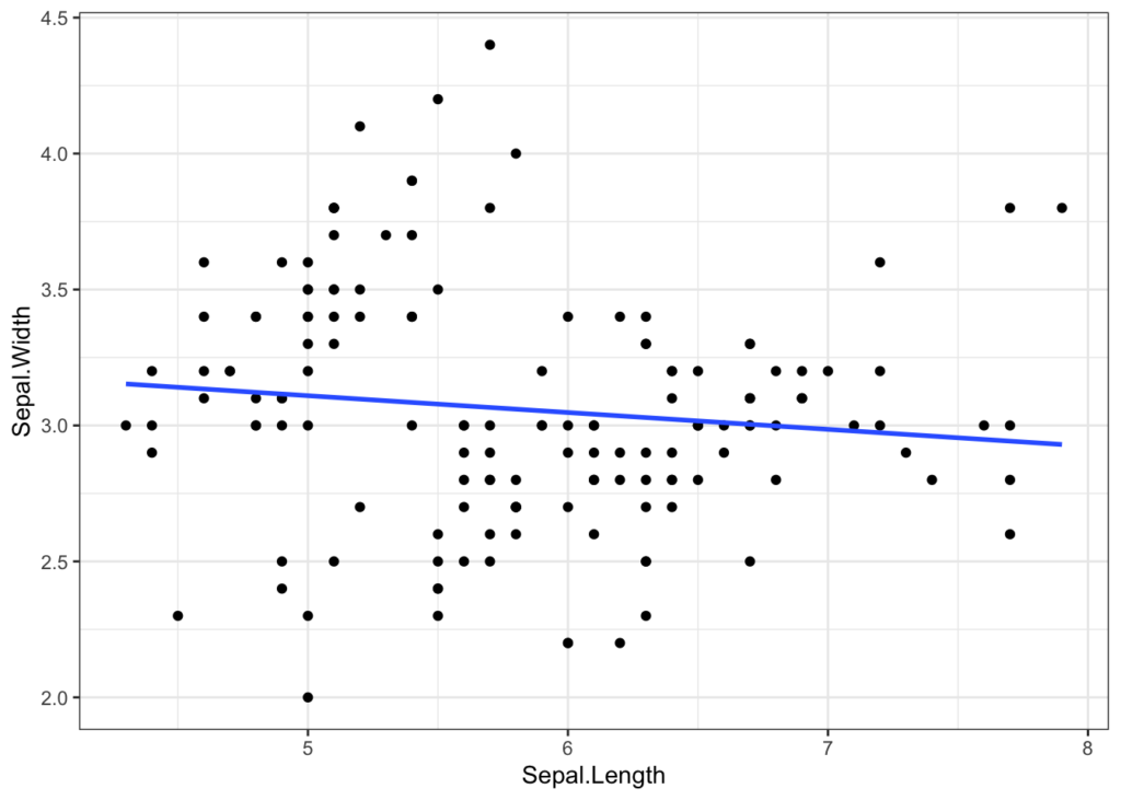
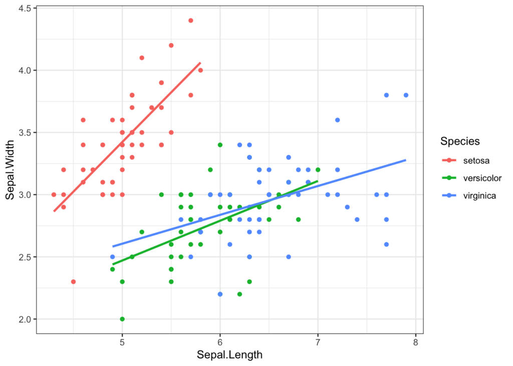
散布図に回帰直線を引く②
iris %>%
   ggplot(aes(x = Sepal.Length, y = Sepal.Width,label = Species, fill = Species, col = Species)) +
   geom_point() +
   geom_smooth(method ="lm", se = F)